->

16 August 2010

Open Layers Heatmaps

Open Layers Heatmaps

"Making Open Street Maps even hotter!"

Open Layers OSM Heatmap
A Great Mashup to show 'HeatMaps' using Open Layers and Open Street Map Features (OSM).
Select a number of OSM Features and create dynamic heatmaps from them.
Note: this is the 'inverted' heatmap view.

Credit to Felipe Barriga (http://blog.felipebarriga.cl/)

If you want to create your own HeatMaps the source code is available via OLHeatmap.


What is OLHeatmap ?

OpenLayers Heatmap is a group of hacks ( talented programmers) to render heat maps over OpenLayers. At this moment is very ugly and dirty but I have some ideas in mind to make this a more presentable project....

Why that name ?

OLHeatmap stands for OpenLayers Heatmap

Video Demo


Video via http://opengeodata.org/osm-heatmaps-in-the-browser-w-openlayers

Heat Map
http://blog.felipebarriga.cl/olheatmap_demo/

Source:
http://blog.felipebarriga.cl/programacion/olheatmap-live-demo/

Labels: , , , ,

25 February 2010

Google Fusion Maps - February 2010 Update

Google Fusion [Tables] Maps - February 2010 Update - More Powerful

An Interesting update here in a previous blog post
Note: Suggestions, would be nice to be able to overlay the thematic map [based in flash] over the Google Map (or creating gpolygons). Sharing with the option of embedding and link to would be convenient.

Well seems like this service has improved:
How?
  • Some new features that will let you upload and map large amounts of geographic data.
  • You can also now hide and show different data depending on your own criteria.
  • Create Custom HeatMaps with your own data.
  • You Do NOT need to be a Developer.
  • Embed Your Map to your website or blog.
Google LatLong Blog has a great example of the new power (without being a developer)
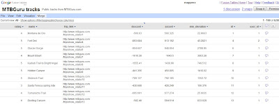
Google Fusion Tables Routes Datasource
Go from the this table of Bike Tracks.. http://tables.googlelabs.com/DataSource?dsrcid=11310

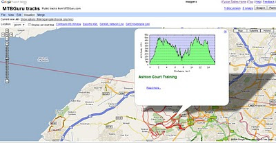
to a nice bike tracks map with routes and altitude on a map with little or no programming.
Google Fusion Tables Routes Mapped

Points are displayed at small scales but zoom in and routes of bike tracks are displayed very fast on the map Note: Goto 'Visualize >Map
http://tables.googlelabs.com/DataSource?dsrcid=132848

http://www.mtbguru.com/ is responsible for this first example using this method, mapperz highly recommends readers to look at the blog post: http://blog.mtbguru.com/2010/02/24/mtbguru-tracks-as-seen-through-google-fusion-tables/
which goes through the motions clearly on how to do this. Then you can try it with your own datasets.

Create Heatmaps
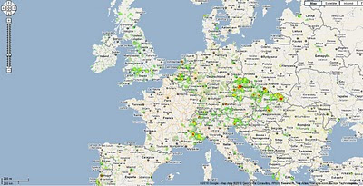
Google Fusion Tables Routes Heatmap
You can even create Heat Maps simply with your own data.

A great way to get started on mapping your own data.

Embed the Map:


(for the coders)

Using iframe
iframe width="500px" height="300px" scrolling="no" src="http://tables.googlelabs.com/embedviz
viz=MAP&q=select%20col0,col1,col2,col3,col4,
col5,col6,col7,col8,col9,col10,col11
%20from%20132848%20where%20col11%20%3E%20'70'&h
=false&lat=49.85392252759648
&lng=14.85626220703125&z=9&l=col10"/iframe

Under the hood:
http://maps.google.com/maps?gwt=1&file=api
&client=google-fusiontables&sensor=false&v=2.x">

var map = new GMap2(document.getElementById("map_canvas"));
map.setCenter(new google.maps.LatLng(49.98,14.88),9);
var l = new GLayer("span style="font-weight: bold;">ft:132848");
<< style="font-weight: bold;">select+col10+from++132848/span"); 
Select column 10 from fusion table ID

map.addOverlay(l);
map.setUIToDefault();
map.addControl(new GMapTypeControl());
map.addControl(new GLargeMapControl());
map.addMapType(G_PHYSICAL_MAP);

Source and More details on http://google-latlong.blogspot.com/2010/02/mapping-your-data-with-google-fusion.html
credit to http://www.mtbguru.com/

Labels: , , , , , ,

24 August 2009

The Hot Tube [underground] Map

The Hot Tube [underground] Map

London Underground Tube Hotspots Temperature Map

Transport for London have release a snapshot of the temperatures that were recorded July 28th - July 29th 2009.
Central Line was the hottest with temperatures up to 32C.

Temperatures seem to be at the highest during 4pm and 7pm


"TfL have revealed the hottest spots on the London Underground to identify the areas which need the most cooling. The heat map compiled on July 28 - one of the hottest days of the year, showed the Central Line was the warmest. Luckily it was already coloured red. That part of the network was above 30C (86F)."

(In previous tests , temperatures in some parts during the summer have exceeded 35C, which would make the network officially unfit for transporting cattle.)


Now if only there was a live version of the map, in real-time.

The Map 'undegroundhotspots' (in PDF format)
http://extras.timesonline.co.uk/pdfs/undergroundhotspots.pdf

source:
http://london-underground.blogspot.com/2009/08/tube-map-shows-hottest-spots.html

Labels: , , , , ,

12 August 2009

BBC Crime Map - Truth About Crime

BBC Crime Map - Truth About Crime

"A unique experiment uncovering crime in a typical British city"

The BBC have chosen Oxford, England because it is as close as they could find to a typical British city. In terms of demographics, and particularly in terms of levels and types of crimes, it is typical of the national picture.

Truth About Crime BBC Heat Map
Heat maps with 'licenced' premises

In making this website and the accompanying television series the BBC worked closely with Thames Valley Police. Oxfordshire Fire & Rescue Service, Oxfordshire County Council Trading Standards Department, Oxfordshire Domestic Abuse Services, South Central Ambulance Service, the John Radcliffe Hospital, and Oxford's Crime & Disorder Reduction Partnership, who supplied the BBC with the original data.

Data Currency:
The data covers the year from November 2007 to November 2008

Why Heatmaps?
'heatmaps' are used to display the crime data, since these offer a clear way for users to see patterns of crime, without requiring users to have the expert knowledge of crime data analysts.

Want to create your own heatmap?
Try - http://www.heatmapapi.com/

View the BBC Heat Map for Oxford
http://www.bbc.co.uk/truthaboutcrime/crimemap/

Labels: , , , , ,

16 June 2009

MSN UK - Local Maps with Local Information

MSN UK - Local Maps with Local Information

Microsoft new service for the United Kingdom:

"a market-leading range of data to allow people to conduct personalised searches of any UK neighbourhood and create an-easy-to-understand map, with all relevant information displayed succinctly on one page."


MSN UK - Local Maps with Local Information
MSN UK overlay Local POI (Points of Interest) for the current map, panning or zooming automatically updates the map with more local information based on users choices in the sidebar.

The coloured polygons represent the local constituencies though out the UK.

One option that is interesting is 'Flood Layer' though not currently available - issues with Crown Copyright and the Environment Agency? ononemap.com has the same issue.

MSN UK Local Map Local constituencies Bing Maps


property portal Propertyfinder.com and Virtual Earth (now Bing) developers shoothill.comMSN UK Local Map Local House Price Heatmap Bing Maps
Find out where "Risers & Fallers" are with this heatmap

Overall , lots of data, managed in a way that it is not totally overload the base maps [TeleAtlas, Ordnance Survey and Collins Bartholomew background maps available].
A good selection of local information is currently available.

Bird Eye View is available but local information is not overlayed - am sure Multimap has this available (Multimap now owned by Microsoft)
See http://www.multimap.com/s/JV2Swe8T
for points in Bird Eye View.

Source:
http://www.techradar.com/news/internet/msn-offers
-localised-property-info-service-608518

Labels: , , , , , , , ,

02 April 2008

The Worst (Data) Map Ever?

The Worst (Data) Map? (There is a good example here too)
*A slight change in direction for this blog but this is to prove a point!

A news article from the Telegraph titled 'Met police map reveals London murder details'
http://www.telegraph.co.uk/news/main.jhtml?xml=/news/2008/04/02/nmurder102.xml

Now you would expect this to be a fairly good source with accurate information

A bad subject matter to map to begin with...agreed

But the Map data is crap.
Richmond, London not Richmond Near Darlington.
The Worst Data Map

Hillsborough, London, not Near Reading..

A simple QA of the data would point that out.

But points for murders based on London Boroughs centroid (center of a polygon)

"In one of the most detailed breakdowns recorded of murders in the UK, figures revealed a sharp rise in the number of teenagers being killed, that there were 70 stabbed to death and 30 shootings, and that the peak time for murder was on Sundays between 12-4am."

Source: Telegraph

Comments about this map - so positive!

just reading the comments of the map
"This map is pathetic. It's dumb to have markers for boroughs rather than murders. You even obscure the basic information about murder count -- we have to click through links and scroll down to see the full list of murder counts, whereas you could have shown the same information more cleanly in a plain text table. You might order it alphabetically (so I can see quickly where my borough falls), or my count (so I can see quickly which boroughs are best and worst). You should do another map with one pin per murder. "

"This map is virtually useless. The best web map of this sort is published by the Los Angeles Times. Each symbol on it represents a homicide, and users can select characteristics such as age, race, or sex, and then map them separately. Moreover, every symbol is connected to a description of the homicide it represents.The map is updated regularly and from it one can follow the changes in homicide incidence from week to week."

source: comments
http://maps.google.co.uk/maps/ms?ie=UTF8&hl=en&oe=UTF8&msa=0&msid=103813223147685278685.0004499363e419659bb34


All valid comments
Visualisation/Visualization was a core subject for Cartography - completely missed here

Okay what is good then Mapperz? (since you seem all so clever)

Nice Polygon Boundaries - showing users the area.
Good Map HeatMap Based on search
Heat Graduation showing the number of returned searches (in this case pizza's not murders)

View this map
http://boston.povo.com/Boston?heatmap&radius=Boston&query=pizza&tags=pizza

*Note its using the same google map api to create both. It's just the way you show your data and present it.
More like this one please!

Labels: , , , , ,