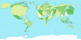
Cartogram Maps of the World

Showing distorted maps that visualise engery consumption, population, child mortality, greenhouse gas emissions etc by country.
More available at WorldMapper
A very good comparison is the UK Population against Canada.
Mapperz - The Map & GIS News finding blog. With so many Mapping sites online. This blog tries to provide you with the best maps and services that are currently available online. @mapperz

0 Comments:
Post a Comment
<< Home