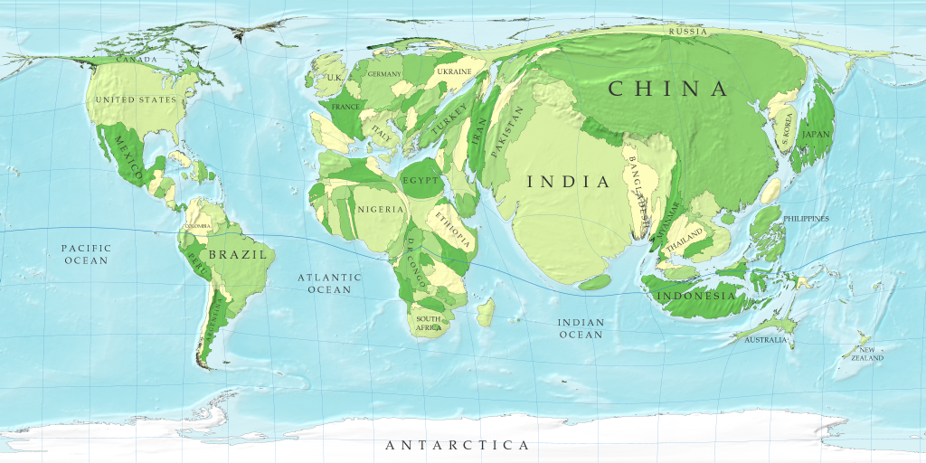
Cartogram Maps of the World

Showing distorted maps that visualise engery consumption, population, child mortality, greenhouse gas emissions etc by country.
More available at WorldMapper
A very good comparison is the UK Population against Canada.
posted by Mapperz @ 8:27 am
0 comments
![]()
![]()


0 Comments:
Post a Comment
<< Home